In what what does your magazine use, develop or challenge forms and conventions of real magazines?
My magazine uses the conventions of a magazine but also developed in a way to make my magazine unique in my way. I do not challenge any conventions because i follow through with the conventions required in a magazine.
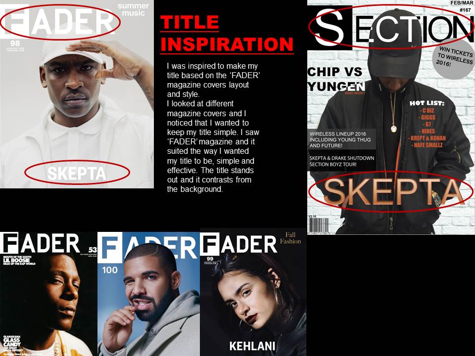
 For my title, i followed to conventions of a magazine. I created my title using inspiration from current magazines. The title for my magazine is quite common in the magazine industry. I researched a lot of magazines and saw that the letters are most of the time close together. I then decided i will go ahead and use this style in my magazine. I used the magazine 'FADER' as inspiration for my magazine title.
I decided to go with a similar style and layout of the front cover of 'FADER' magazine. I placed the main title and the main coverline in the same places as the 'FADER' magazine as i liked the simple but effective look of it.
I also added a few of my touches to it to make it look unique and not too similar to the 'FADER' magazine. These include colour. I used a different colour on the main coverline, whereas, 'FADER' uses white or black most of the time. I used colour as i want my magazine to stand out from all the other music magazines. I stuck to the colour scheme which was mostly black, white and grey but also a couple of colours from the clothes of the model such as orange.
I also stuck to the convention of the title being big and bold to stand out to the audience and grab the readers attention. I also kept the original convention of a normal magazine and placed the bar code at the bottom left of my magazine with the price of the magazine above it.
Another similarity between my magazine and a lot of music magazines, especially grime, is the medium shot of a music artist in the centre of the page of the front cover.
No comments:
Post a Comment